[The following analysis was contributed by my friend Larry Amernick. His work has appeared here in the past, including excerpts from The Amernick Letter, which is no longer published. He is a former president of the Technical Securities Analysts Association of San Francisco.]
Last Wednesday’s brutal response to a mildly hawkish Federal Reserve announcement triggered two opposite market signals. First, the unusual nature of the sell-off in technical terms told us that the great secular bull market that began in 2009 is probably over. Second, the intense selling generated oversold readings that were bound to produce a short-covering rally, as they indeed have.
The stock market is always coming and going at the same time, depending on which time frame one is using to measure the trend. It is an irrational and sometimes fragile creature of human emotions, and that’s why it can be so difficult to predict. Nevertheless, let’s take a closer look, using the October 1987 Crash for comparison. It turns out the tape was actually more bearish this time, even though losses in percentage terms were nowhere near those of the earlier crash. In 1987, the McLellan Oscillator, which measures breadth, was a scary -110.14; on Wednesday, however, it registered an astounding -203.34. The advance/decline line differential was just as scary: -1921 in 1929 versus -3468 this time. The three-day exponential moving average was -1594.85 versus–2444.89.
3% Versus 22%
Why did the market drop a mere 3% on Wednesday, compared to 22% in 1987, even though tape action was arguably worse this time? Although many stocks fell, they did not collapse; they moved only a few percentage points lower. It was the astounding breadth readings that made the difference. Call it a foretaste of what could come in January.
For good measure, I have applied a volume momentum indicator recently created by Buff Pelz Dormeier. I use a variation based on a 34-day Money Flow Index. In 1987, the indicator was close to being oversold, while last week’s reading was closer to an overbought peak. This discrepancy gave us to expect the short-term bounce that ended the week, with sellers spent.
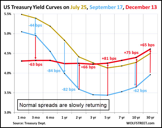
Yield Curve ‘Normalizing’
My proprietary model turned negative in June for four consecutive weeks. Usually, the model issues one or two signals before a major market change occurs. But never have there been six signals in one year, as has just occurred. What was missing earlier was that the yield curve was inverted and had been that way for nearly two years, the longest inversion ever. Since then, it has begun to normalize, with longer-term rates slowly rising above shorter-term. (See graph above, from WolfStreet.com.) The process has further to go before the spreads widen to historical norms. However, markets have a tendency to fall apart not when the yield curve inverts, but when it starts returning to normal. That is why I have interpreted my data somewhat more bearishly than I might have otherwise.
And if you’re superstitious and believe in curses, there is this headline from the latest edition of Barron’s: “Stocks Could Gain Another 20% in 2025. Embrace the Bubble”. Contrary indicators don’t get better than that. Famed market technician Martin Zweig was the first to write about this phenomenon years ago. He argued that Barron’s cover stories at market extremes were contrary indicators. We are hardly going out on a limb to expect a short-covering rally this week, possibly into next, followed by a painful drop toward the beginning of 2025.


Right on Larry